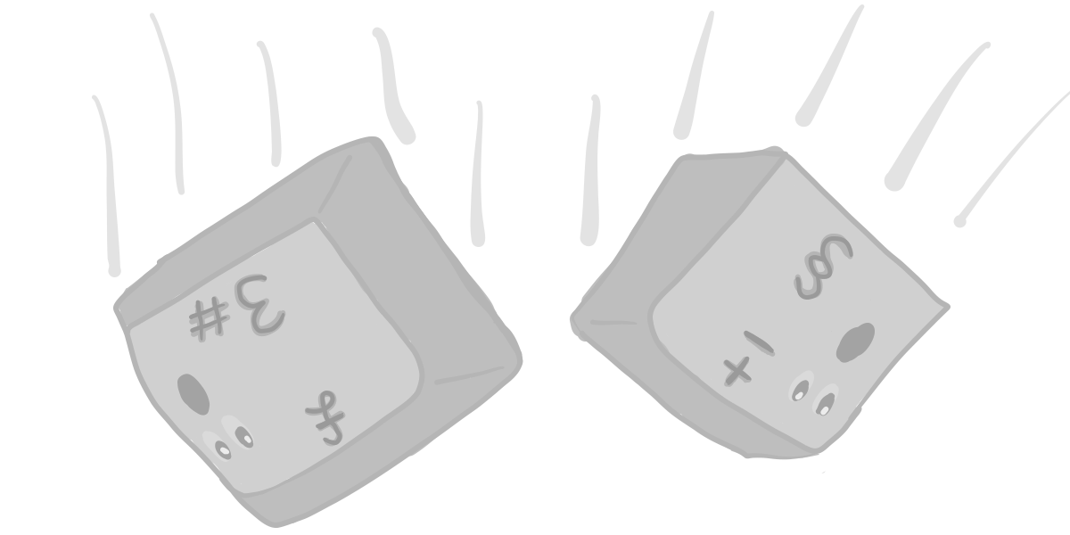
When you look closely at UK keyboard layout, it does not make sense: 1) useless keys… 2) …at located at strategic places; 3) plus weird key shape.
Corner key
Compare the top left corner key on Mac UK and US keyboards:
That’s an entirely useless key on a UK keyboard!
Windows keyboards are not better — the UK layout allows you to type a weird negation ¬ character:
The corner key position is significant, and it should not be wasted.
Enter
Compare the shape of Enter (taken from the latest MacBook pro):
While the UK Enter key is twice as tall, it’s still not easier to click because the key’s base is even narrower than the standard key’s:
I was observing how I click Enter on my US keyboard, — I tend to click it with two fingers:
Well, that would be not possible on UK layout keyboards.
But the pound!
How do you type pounds and euros on American keyboards?
The pound sign is Shift + 3 and euro sign is Alt + 2 — just set the System Preferences > Keyboard > Input Sources to “British”.
Takeaway
Consider switching to US-layout keyboards. Those small things add up, especially if you are a developer.
