Installation
Quick Take
Examples
Open playgroundPurpose
This is a rehype plugin to help display HTML tables on narrow screens. First, look at the playground.
As with all Unified plugins, it can process both HTML and Markdown, which contains HTML (see examples).
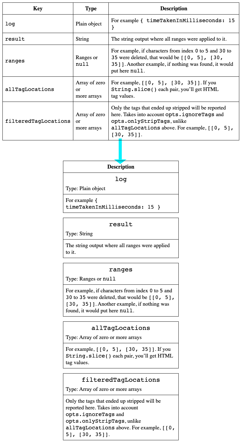
Unlike our competition, this plugin lets you customise what happens to each column, depending on its thead string label (wrapping tags, if any are stripped when calculating the label).
For example, I can “lift” only “Type” column cells.
API
Plugin accepts an Optional Options Object; it goes as the second argument into .use(), for example:
import { rehype } from "rehype";
import rehypeFormat from "rehype-format";
import rehypeResponsiveTables from "rehype-responsive-tables";

let res = rehype()
  .data("settings", { fragment: true })
  .use(rehypeResponsiveTables, {
    tableClassName: "rrt-table",
    newTrClassName: "rrt-new-tr",
    hideTdClassName: "rrt-del-td",
    gapTrClassName: "rrt-gap-tr",
    newTrSpanTopClassName: "rrt-new-tr__span-top",
    newTrSpanOtherClassName: "rrt-new-tr__span-other",
    up: ["Type"],
  })
  .use(rehypeFormat)
  .processSync(input)
  .toString();

console.log(res);
The Optional Options Object has the following shape:
Here are all defaults in one place for copying:
tableClassName
Default value: rrt-table
tableClassName is the CSS class (a string) set to the <table> tag. It can contain multiple CSS classes separated by a space. Any existing classes are retained.
newTrClassName
Default value: rrt-new-tr
Let’s say you pass the following table to this plugin:

The plugin will generate extra cells:
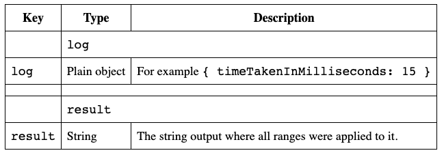
CSS class newTrClassName is set onto these new rows (<tr>s):
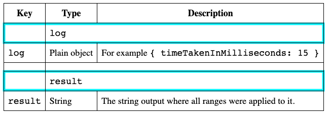
Now, you can hide this row on the “desktop” layout:
@media (min-width: 451px) {
  .rrt-new-tr {
    display: none;
  }
}
hideTdClassName
Default value: rrt-del-td
Let’s say you pass the following table to this plugin:

The plugin will generate extra cells:

CSS class hideTdClassName is set onto all cells in the first column so that you can hide them on mobile:
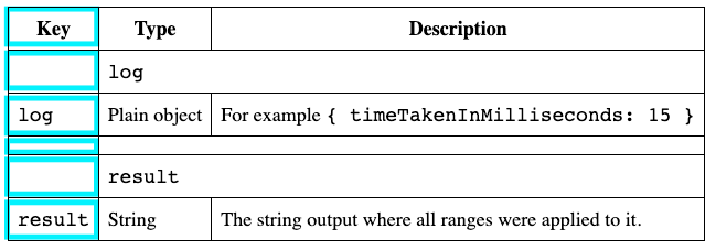
You can hide this row on the “mobile” layout:
@media (max-width: 450px) {
  .rrt-del-td {
    display: none;
  }
}
gapTrClassName
Default value: rrt-gap-tr
Let’s say you pass the following table to this plugin:

The plugin will generate extra cells:

CSS class gapTrClassName is set onto this gap <tr>, which gets added under each original <tr>:
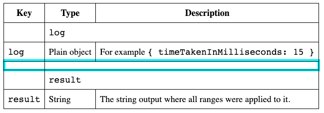
You have two options:
- if you want the gap to be visible on mobile, hide its left and right borders there:
/* on mobile, we hide outer borders: */
.rrt-gap-tr td:nth-child(2) {
  border-left-color: transparent;
  border-right-color: transparent;
}

/* then, on desktop, we hide the whole TR: */
@media (min-width: 451px) {
  .rrt-gap-tr {
    display: none;
  }
}
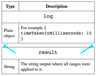
- if you don’t want this gap, style it
display: noneeverywhere (on desktop and mobile).
newTrSpanTopClassName and newTrSpanOtherClassName
Default values: rrt-new-tr__span-top and rrt-new-tr__span-other
Let’s say you pass the following table to this plugin:

The plugin will generate extra cells:

But then, you tweak the config and “lift” up the “Type” column via opts.up, for example:
let res = rehype()
  .data("settings", { fragment: true })
  .use(rehypeResponsiveTables, {
    up: "Type", // <---
  })
  .use(rehypeFormat)
  .processSync(input)
  .toString();

console.log(res);
“Type” column cell values placed under the label, inside new <tr>, with the help of <br>:
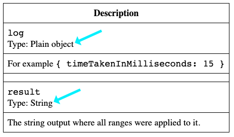
The first column’s label is wrapped with a span with a CSS class newTrSpanTopClassName, and then all labels that follow are wrapped with a span with a CSS class newTrSpanOtherClassName.
@media (max-width: 450px) {
  .rrt-new-tr__span-top {
    font-size: 1.2em;
    display: inline-block;
    text-align: center;
    width: 100%;
    margin-bottom: 0.5rem;
  }
  .rrt-new-tr__span-other {
    font-weight: bold;
  }
}
Sticky thead
You probably noticed that the table headers are sticky in playground example. That’s CSS styles:
thead {
  position: -webkit-sticky;
  position: sticky;
  top: 0;
}
I also set a background color to <th> because otherwise, it looks not good when other text overlaps:
th {
  background-color: white;
}
up
The Optional Options Object’s up value is an array of zero or more strings — labels of each thead column you want to “lift” up.
If you want to lift all columns to get a result similar to our competition, put the wildcard *:
import { rehype } from "rehype";
import rehypeFormat from "rehype-format";
import rehypeResponsiveTables from "rehype-responsive-tables";

let res = rehype()
  .data("settings", { fragment: true })
  .use(rehypeResponsiveTables, {
    up: ["*"],
  })
  .use(rehypeFormat)
  .processSync(input)
  .toString();

console.log(res);
Which results in something like this:
